As I am currently exploring Type and Image in this Graphic Design Module, I concluded it would be beneficial and important to conduct my own research. So to start, I am going to research Paul Rand, who gained fame for his logos, typography and composition.
Paul Rand is widely known for his logo creations for brands such as Next, Adobe, UPS and IBM. A few iterations of his logo creations are presented below.
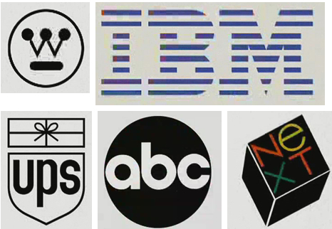
As shown, these brand logos are globally recognised. This relates to the topic of Semiotics, which I briefly learnt during a recent presentation from my lecturers. I am now going to analyse the processes and techniques Paul Rand uses to construct typography in his work, so effectively how to build up effective type supporting imagery This requires images to observe and analyse, so I am going to find and source Secondary source examples from online, which will be situated below.
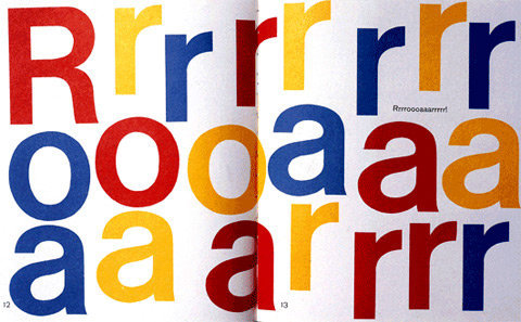
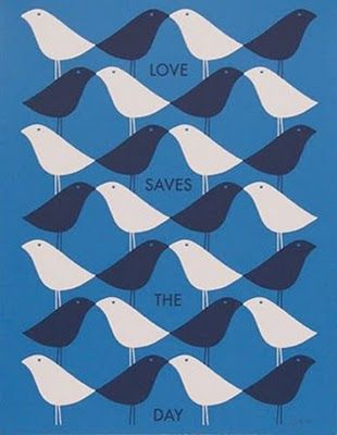

From observation it’s clear to see Rand likes his use of eccentric bald colours, mostly bright in nature. His illustrations appear to have a ‘vector’ like origin, however they have been hand and machine rendered, without the use of design software. This is highly impressive, as the lines curves are perfectly crisp, and the colours are consistent. Colour contrast is a largely played with technique that Rand uses. He often formats an image of bright content, with additional dark shapes contrasting and segregating the composition. This contrast is then perfect for text implementation of the opposing colour to be placed inside the contrasting one (seen in the above poster imagery). This technique is used on regular occurrence to his poster work, which requires text and information. This shows that contrast is important for Information Graphics.
Specifically in type, both overlapping and isolation are used often in Rand’s work. To give example, the top ‘Roar’ artwork uses spacing between the lettering to allow smooth passage of the whites’ visuals. Also, due to the lettering being placed in a purposely incorrect format, the spacing needs to occur for the letters to stay clearly legible. If the letters were overlapping, and the word isn’t spelt in the correct orientation, the correct meaning isn’t legible and will not be conveyed. So in terms of legibility, Rand uses colour and space to maximise audience readability.
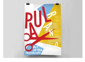
The second image presented in the given examples uses overlapping techniques with low letter opacities. This mergence creates new dynamics, as new shapes are created from the overlapped – and more solid filled – areas of the letters. Rand mainly uses techniques of that sort with graphic illustrations, so it’s interesting seeing it develop with text. This is something I may experiment with when it comes to creating and developing my own letter experiments in the booklet and poster.
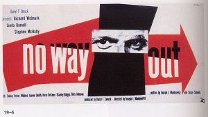
Paul Rand has a strong grasp at visual communication. His colour use enforces dominance, and his composition forces flow. The scissor image composition is my favourite. I can take inspiration from this, to help inform my own work. I will next research an artist who deconstructs typography, to evaluate and understand what different typographic techniques can be found. These artist research blogs will also be put into my sketchbook, to show real media considerations, development and processes in my module.
