As I am currently exploring Type and Image in this Graphic Design Module, I concluded it would be beneficial and important to conduct my own research. I have previously studied the ‘construction of type and image’ by looking at the work of Paul Rand, to contrast, I am now going to research David Carson – a personal favourite Graphic Designer.
David Carson is iconic for his use of deconstructive techniques with typography, and his elaborate image use parallel with it. He often breaks the ‘laws’ of design with his products, and puts Gestalts’ theories of visual perception to the extreme.

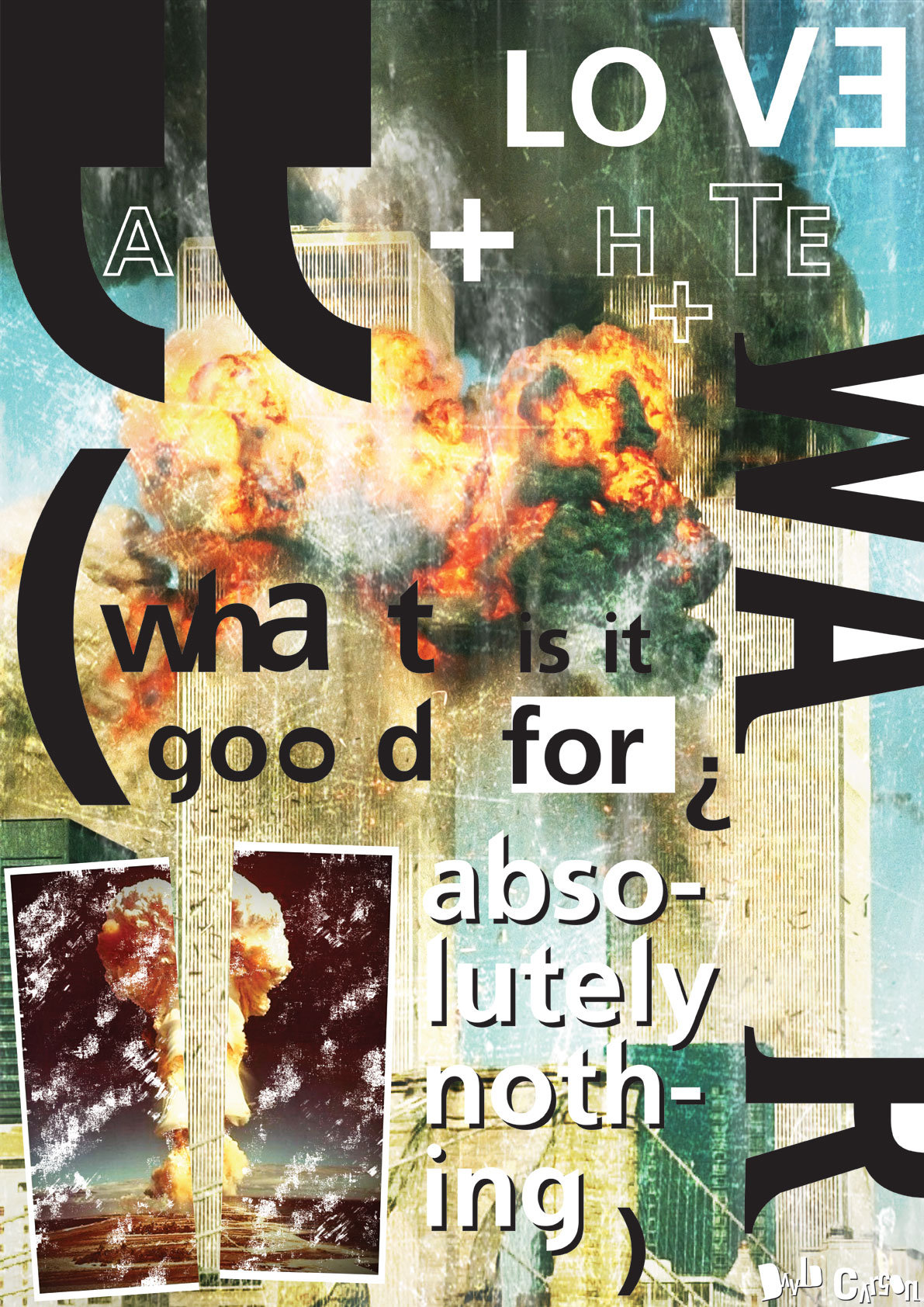
cMag561 – Ray Gun Magazine cover “Henry Rollins” by David Carson / Issue 1 / November 1992
As seen in the given example above of a Ray Gun magazine cover, Carson blends imagery in conjunction with type, overlapping each other, therefore grouping visual dynamics. The position of the left text makes the audience drift eye direction from left to right, in a natural reading progression. This gives ease to viewing the image, making it legible and nice to look at. Carson has also used other techniques within this image, ones that follow the theories of Gestalt.
Similarity, a Gestalt principle is used with the dark text and eyebrow illustration. This reinforces the eye direction with smooth flow. As there is no contrast, your eye will unknowingly group these colours together. This then leads to the principle of Closure. Closure groups similar visual images together to fill gaps and create mental shapes in our head, as that’s how our minds are set to observe and recognise visual imagery. This is used in the image above with the vertical dark graphic, which is the same colour formats are the text and eyebrow imagery. This closes off the cover on the left side, making the image more acceptable to view, as the similar colour group is recognised and groups the page with metaphorical boundaries. If you place your hand over the horizontal graphic and hide it’s appearance, the cover page has a very less effective dynamic flow, as the dark images just seem to float in the image meaninglessly.
This proves that David Carson understands and implements the principles of Gestalt theory. However he uses his own methodology too, deconstructing typography that allegedly breaks the given rules of known type.


Above is a selection of my favourite pieces designed by David Carson, all sourced. As seen, they all implement a principal of Gestalt of one way or another.
Deconstructing text and type is difficult. Deconstructing text and type effectively is a greater challenge. I’ve been told many times by my lecturers that “You need to understand the rules before you break them’. David Carson evidently knows this content well. I viewed some of his TED Talks to gain understanding of his knowledge, and to get some contextual information that wouldn’t be present from web pages. A video example from 2003 can be found below.
I find Carson’s artwork highly inspirational, and researching his techniques and gaining understanding of them will definitely benefit and motivate my own personal Type and Image experimentation. I will not go as far as deconstructing typography to the extent Carson does, as i’m still developing and learning how typography is constructed and used effectively in different ways. I value how Carson uses hierarchy to dominate specific important words in his designs, and reduces the scale of other text, often mixing it more with the select imagery. He’s one of few artists i’ve seen effectively combine text and type, making them both equal as importance values are concerned. Infact, the text is often presented in a more important visual manner than the images. It’s important for me to understand these typography uses, as they can help inform my own experimentation in the booklets and poster I’m creating in this module.
On that subject, now that I have researched appropriate type and image artists, and have recorded the contrast between construction and deconstruction of typography, I will next continue to finish the booklet tasks, and develop my sketchbook.
